Type design • Editorial
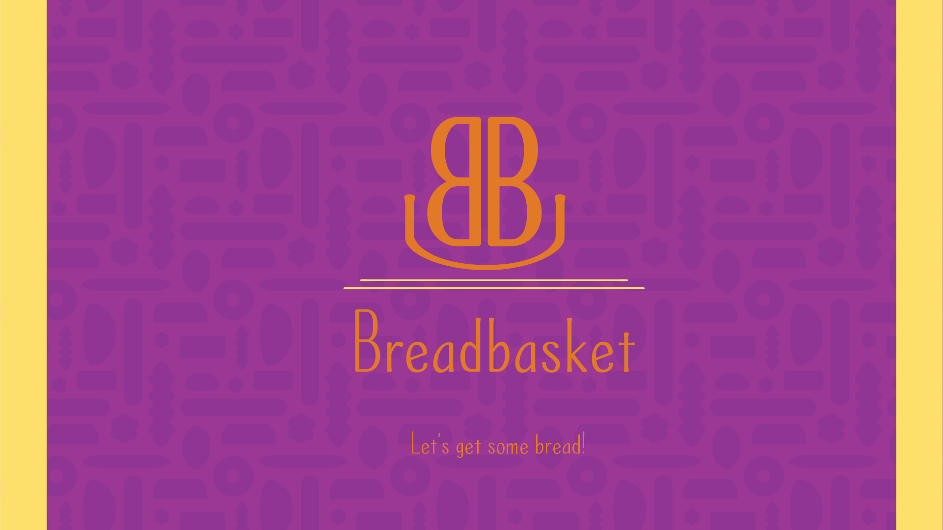
Breadbasket
A typeface designed for your very own bake sale.
Project Brief
Create a sans serif or serif typeface and specimen.
Created Feb 2022


Inspiration


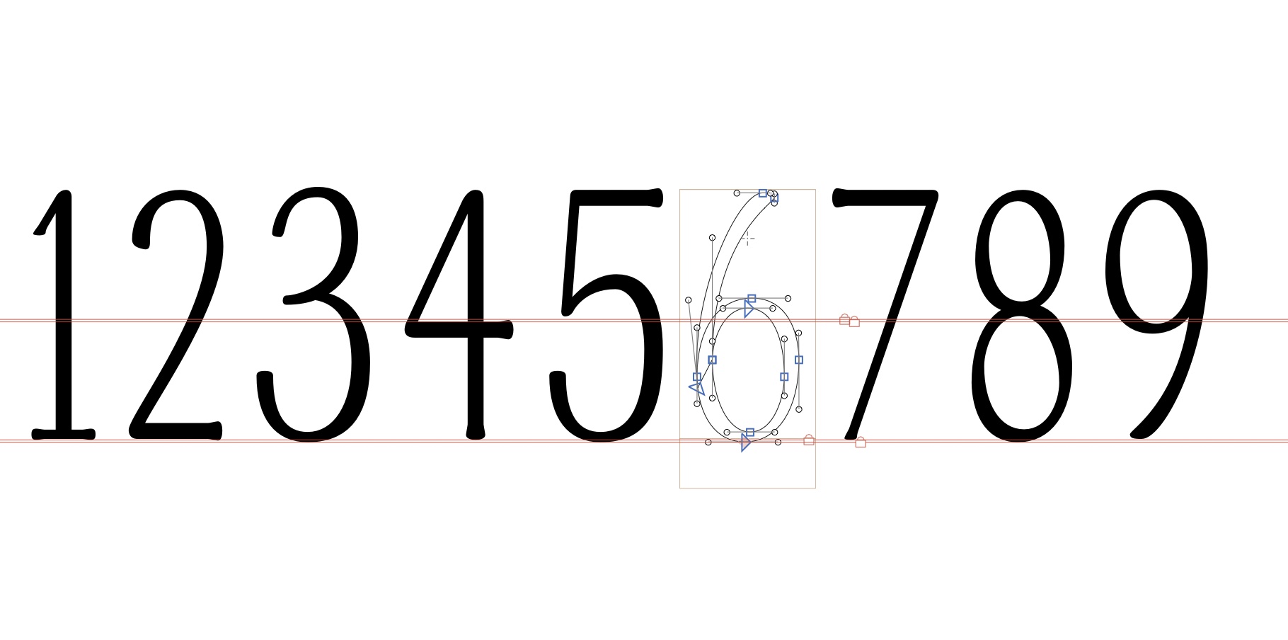
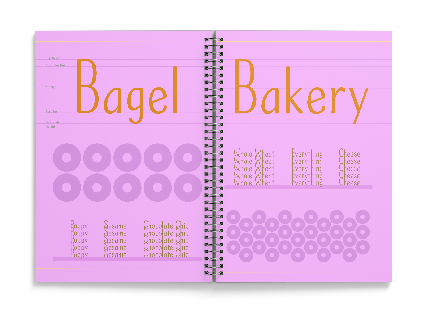
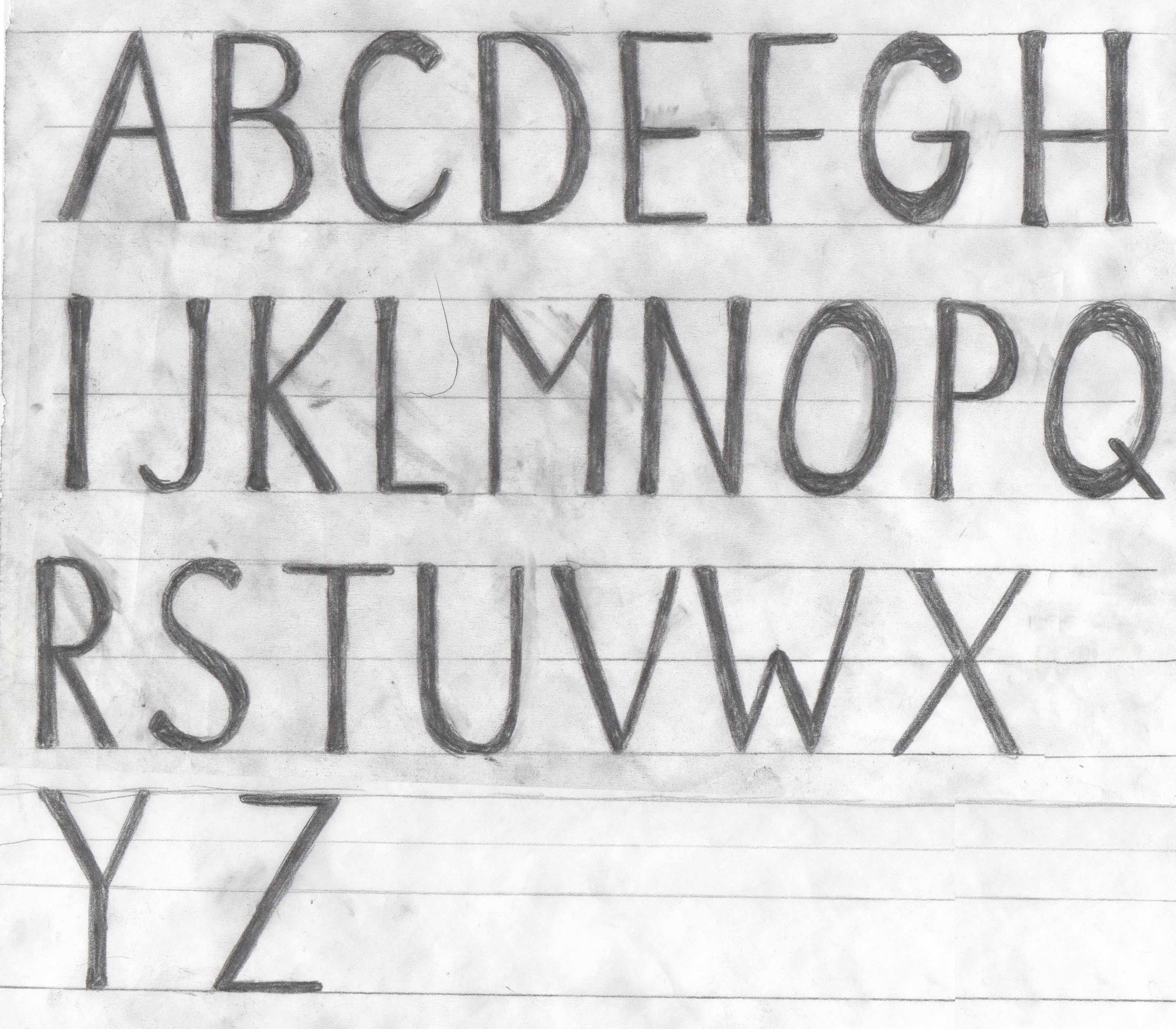
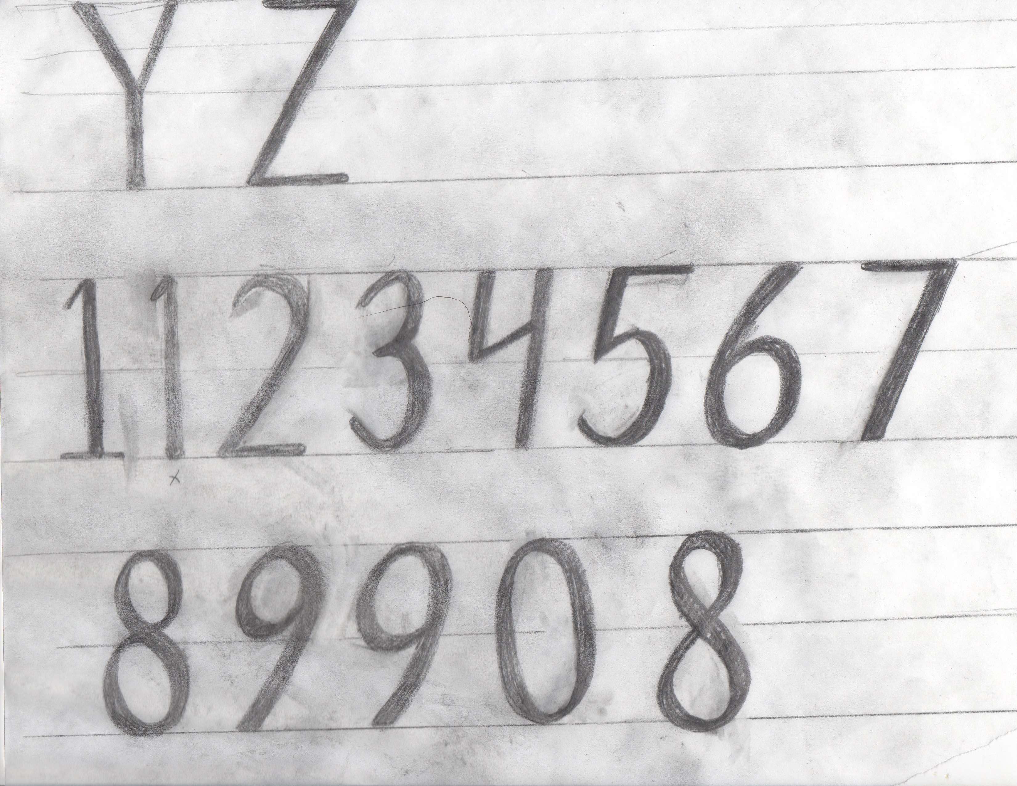
This project started out with a fairly strong direction; I knew I wanted to do a friendly typeface with an almost handmade quality that would compliment my natural handwriting. It ended up being a standardized version of my handwriting, weird quirks and all. The letterforms are awkwardly tall with capitals taller than the ascenders, which makes the niche incredibly small; it’s a display typeface through and through.
I wanted to make a typeface that could be used for my online art store, which displays as a similar personal brand to what I use on this site: something friendly and fun. The name comes form the idea of a breadwinner and the saying “putting all your eggs in one basket,” something I try to avoid. The font ended up as my headers on my page, because of its legibility issues at small sizes.
I wanted to make a typeface that could be used for my online art store, which displays as a similar personal brand to what I use on this site: something friendly and fun. The name comes form the idea of a breadwinner and the saying “putting all your eggs in one basket,” something I try to avoid. The font ended up as my headers on my page, because of its legibility issues at small sizes.
Specimen Design
Some of my favorite stores are bakeries, proudly displaying handmade products to a hungry audience. I took inspiration from the breads sold in the patterning and from the menus for general feeling, though I couldn’t replicate a menu without using a secondary font. I decided to purely use Breadbasket as a sample of why the font was better used as a display. In contrast to the earthier tones of bread bakeries, I opted for a purpler shade to add more personality to the pages and avoid the bread aspect to completely overtake the design.

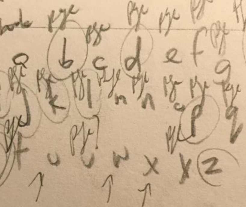
Type Sketches

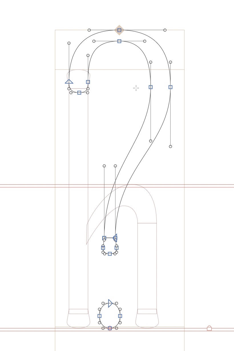
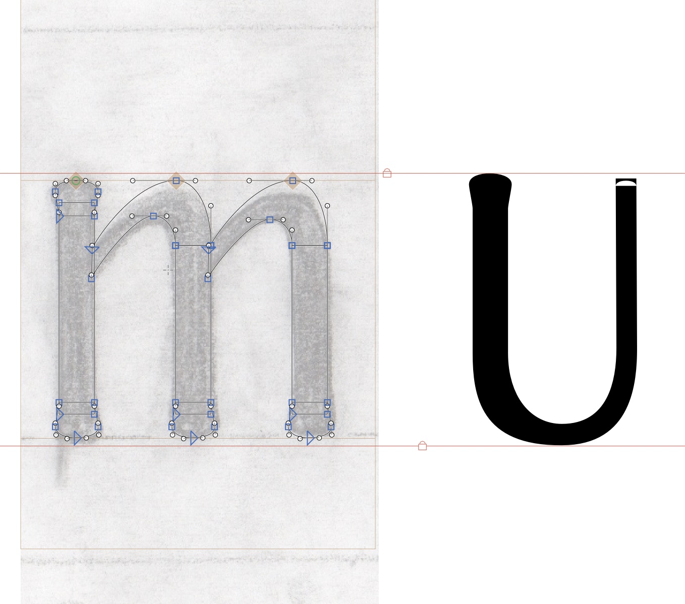
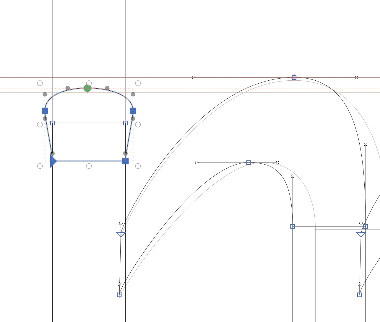
Building the Letters